I’m Sébastien Tremblay, a Montréal freelance interactive art director working under the name Visual Ruckus.
I work with brands to develop a digital presence that enables them to connect with their consumers and reach their goals.
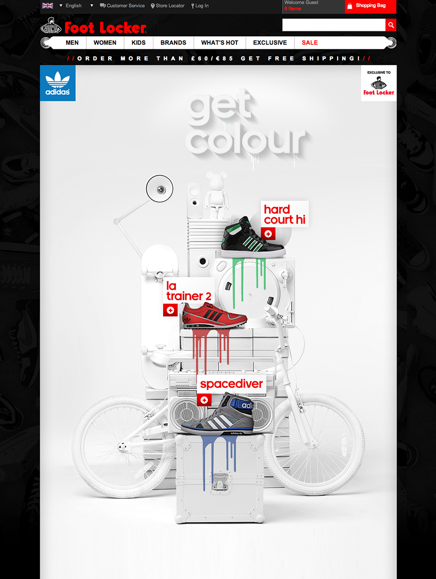
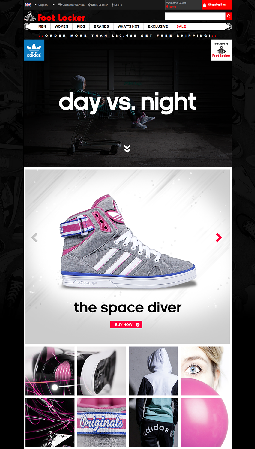
You can see some selected work I’ve done for Dispatch Coffee, Cirque du Soleil, Rudsak, Adidas and more.
Or just keep on scrolling.
Dispatch Coffee
Dispatch Coffee
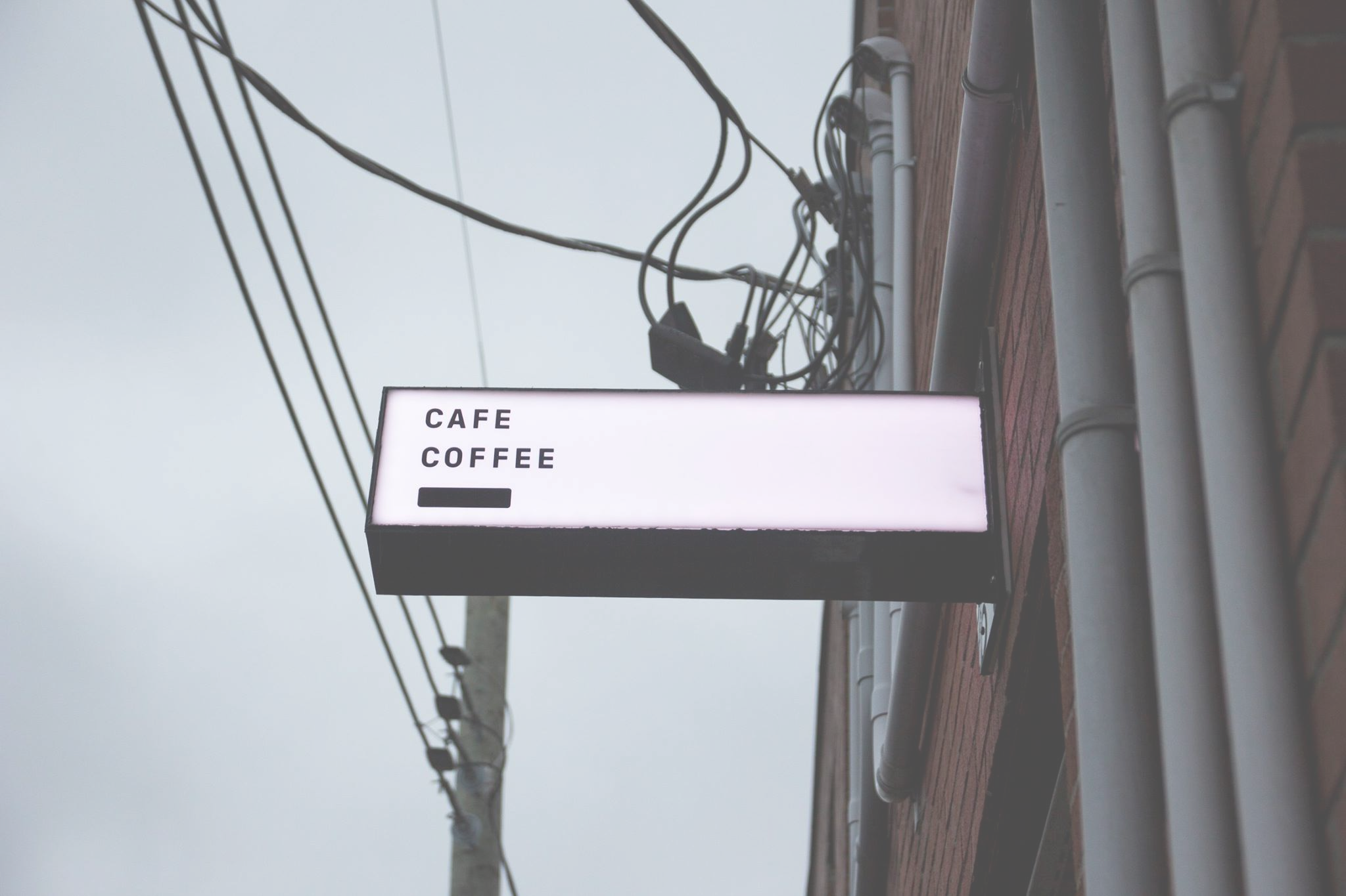
Dispatch Coffee started as bike delivered vietnamese coffee that then became the first coffee truck in Montreal.
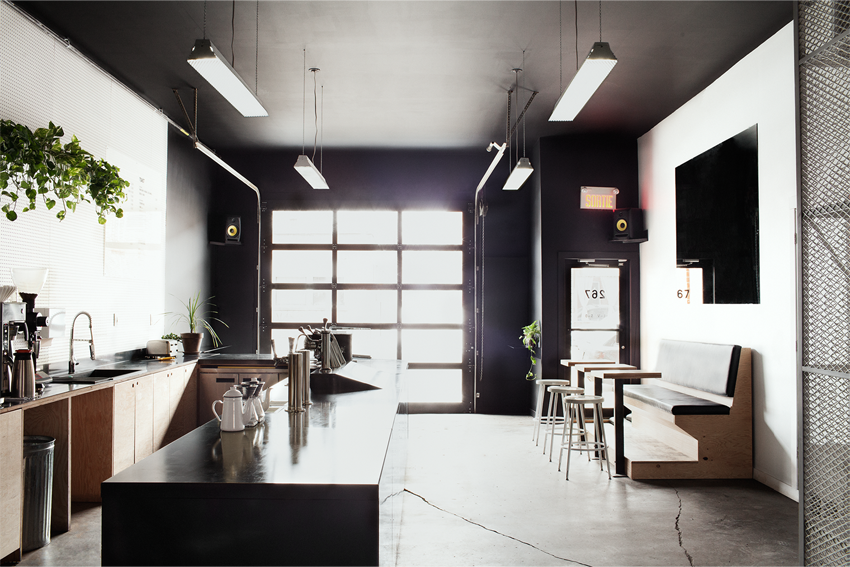
At some point, they then decided to open their own brick and mortar café to start roasting their own coffee in order to bring their craft even further.
That’s when Chrissy Durcak of Dispatch approached me with the full-on rebrand project: the logo, the stationary, the packaging & the website.
After enlisting the help of Elisabeth from TagTeam to work on the logo & print matters, I could oversee the creation as a whole and focus on conceiving the website.
The logo drew inspiration from the minimalism & bluntness found in the visual world of the transport field. We were driven to do so to achieve our aim of reflecting the brand’s accessibility, transparency and of course, having a non-negligeable hint to their first venture, a coffee truck.
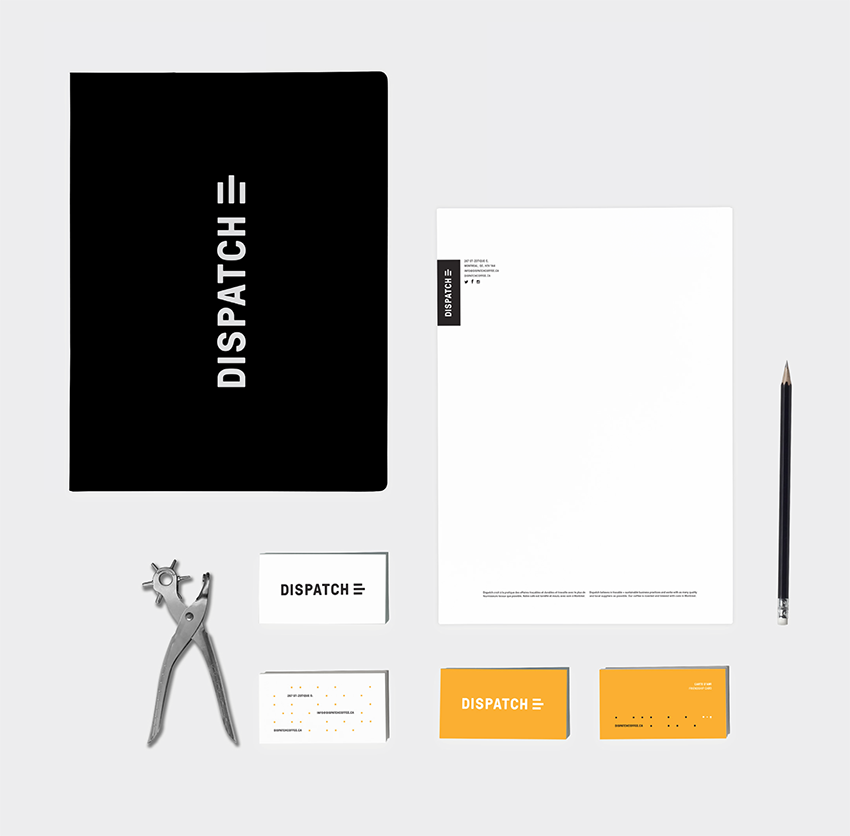
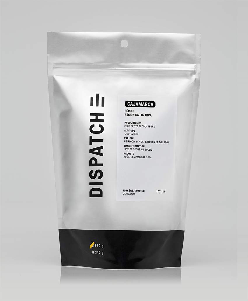
We ultimately chose to keep a really raw and simple visual across the stationary and packaging.
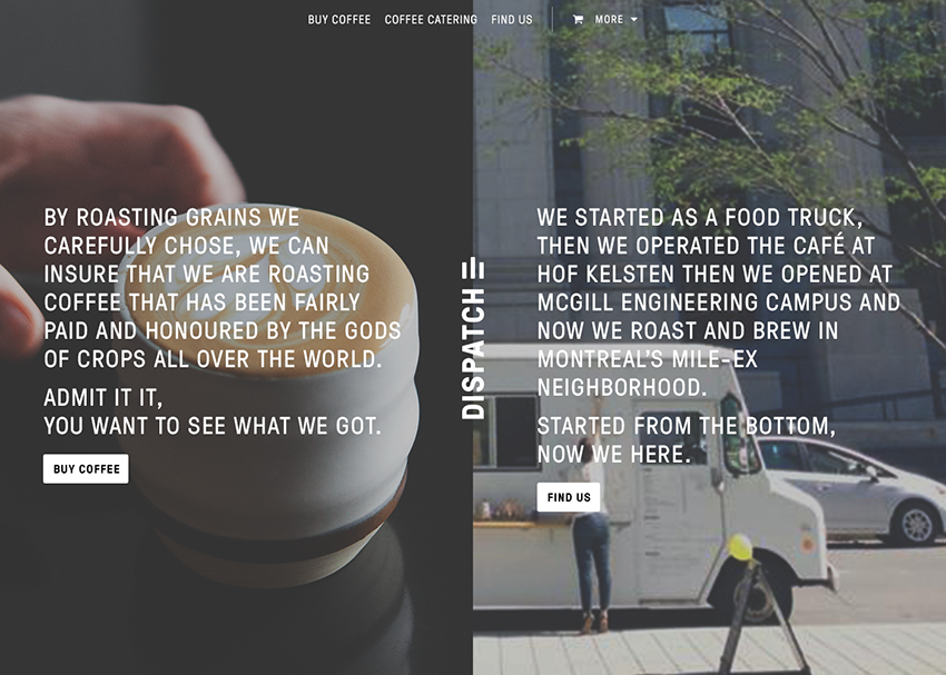
By doing a benchmark against other competitors, we realized that none of their website had any precise focus nor direction on their website. Most of the time, they were barely online shops or bland landing pages with no concrete relation with their own brand.
This is how we came to center the website around two main actions: buy coffee (with sub actions buy coffee and coffee catering) & find us.
This is also what the concept of the homepage was born out of.
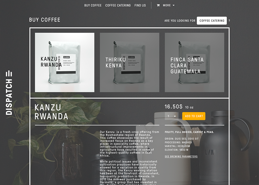
In line with other brand material, we have kept a very raw feel to the website with a strong sense of hierarchy and grid organization.
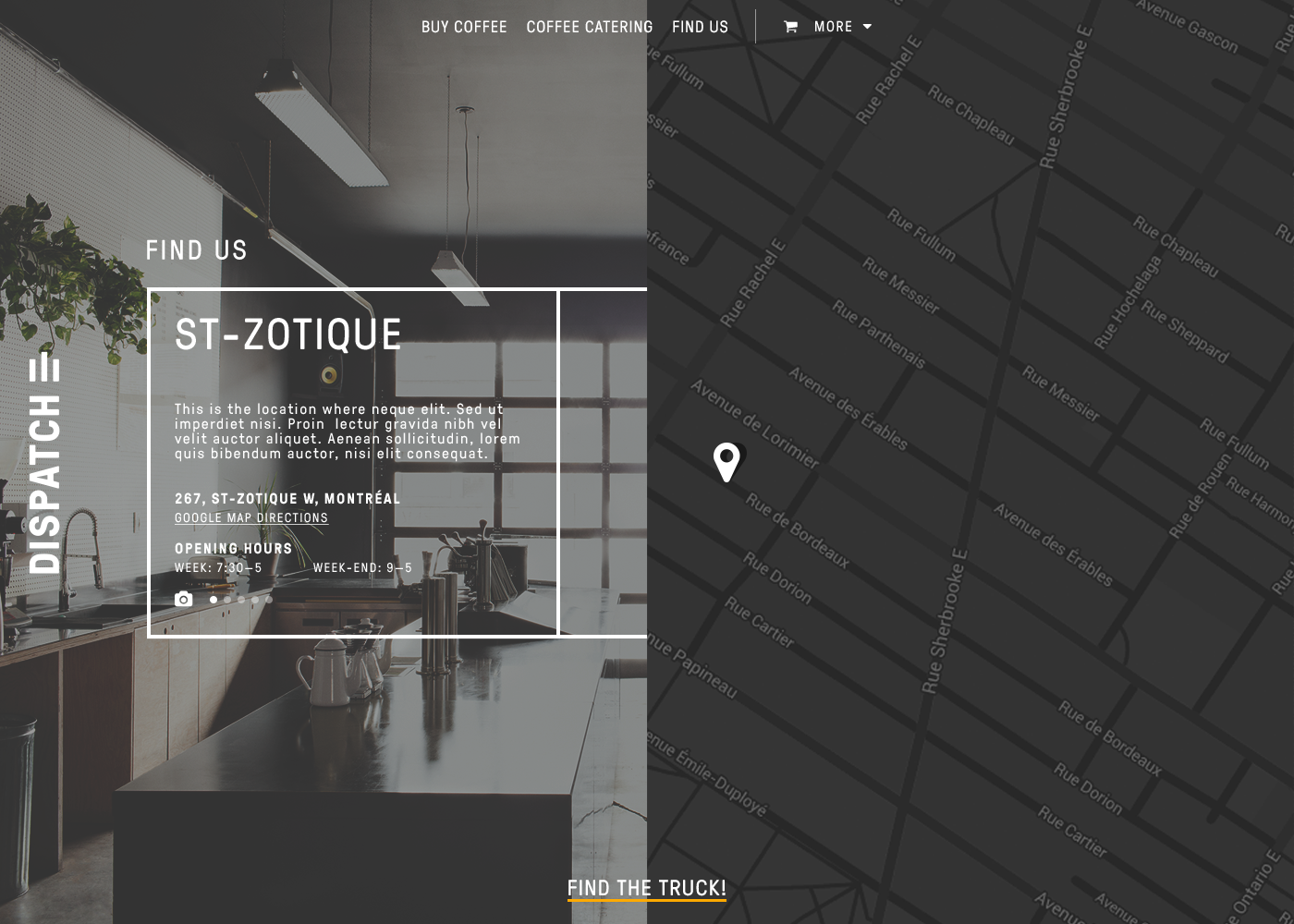
A unique feature we developed for the website was the map functionality for the foodtruck. The foodtruck location can simply be updated by the employees from the truck and people can reliably find the truck when it's out of business.
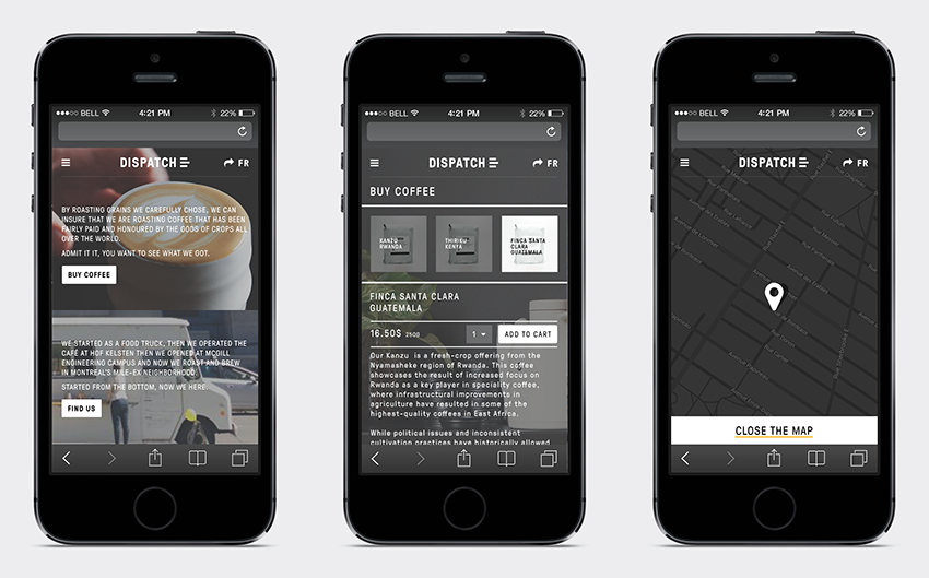
The website was coded in a short timeframe and the extraordinary front-end magic was all done by human extraordinaire Simon Guérin.
Cirque du Soleil — Joyà
Cirque du Soleil — Joyà
When Sid Lee approached me to design the website for the Cirque Du Soleil latest show, I was more than thrilled. As I would learn, it was the first time they'd build an amphitheatre and include a culinary dimension to the show.
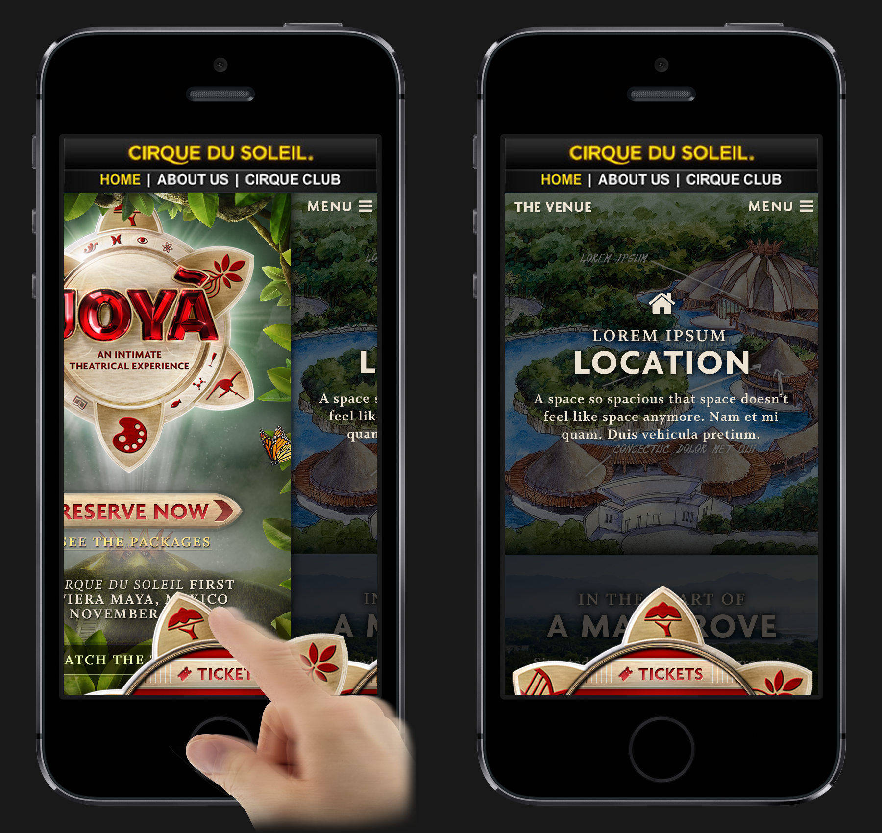
As it was the first show of its kind for the Cirque, they wanted to build a website just as unique. The website went through several concept flips because of the strategy and the last concept I've worked on was this one: a simple but immersive introduction to the world of Joyà that flirted on the line of storytelling and ticket selling.
I've started the design on mobile since it'd be the more challenging medium through which the website would shine. During the conception, I had to work closely with the developers to make sure all of this would be realizable.
The client went with another design as the strategy changed once more after I left.
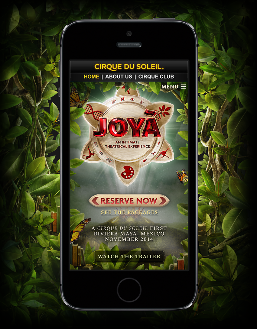
When the design phase started, we had little visual ressources available from the show, so we chose to work more on the concept of the website. The story of the show being set in a mangrove, we wanted to create an exploration-like feel to the navigation, like you would explore a jungle.
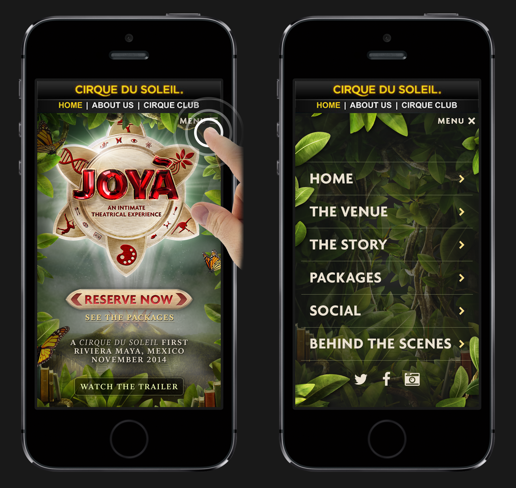
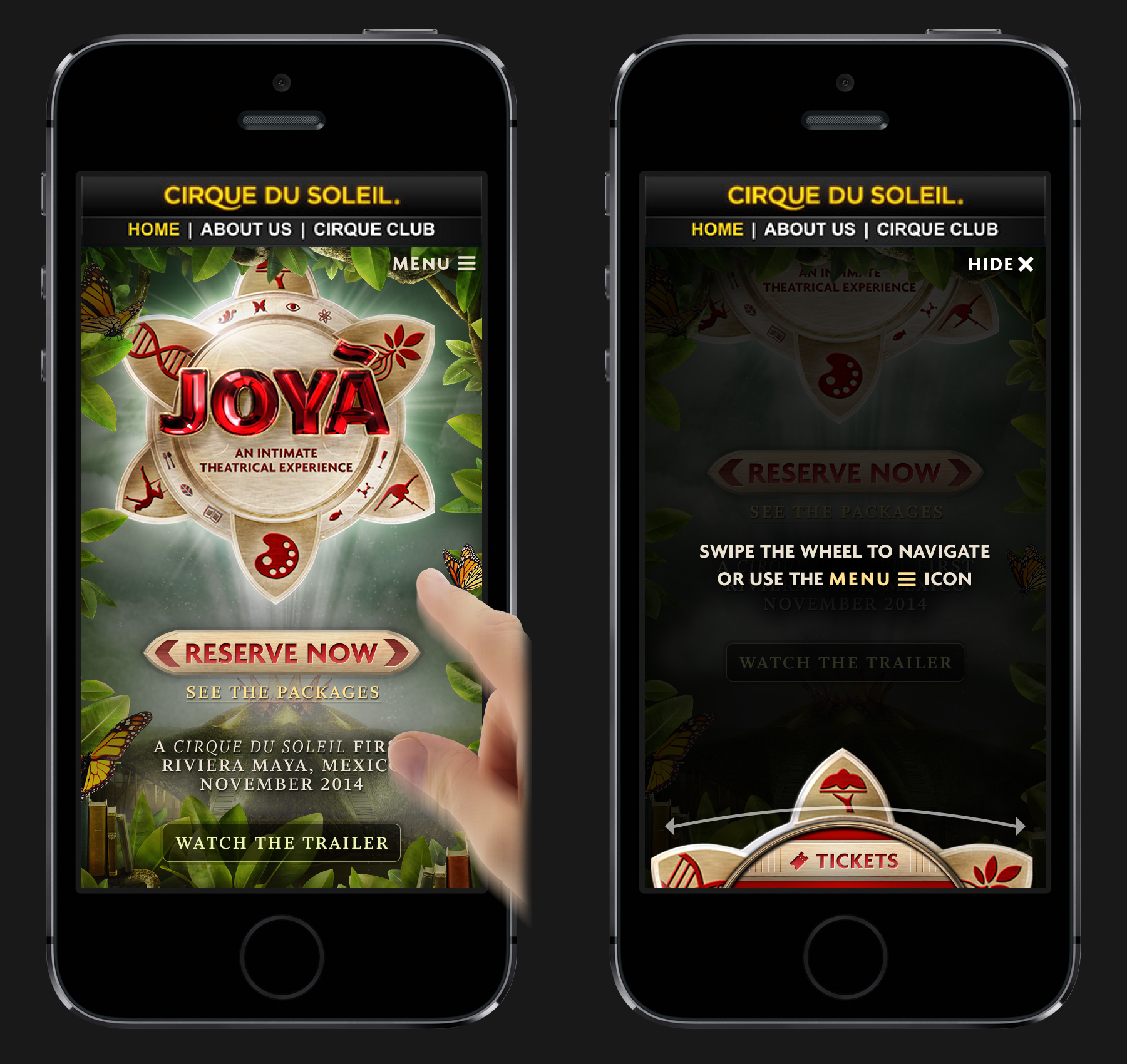
Even though there was a classic menu, the website navigation was based on the wheel in Joyà's logo in which we would illustrate every dimension that would be part of the show. The user could go from section to section by spinning the wheel.
Rudsak
Rudsak
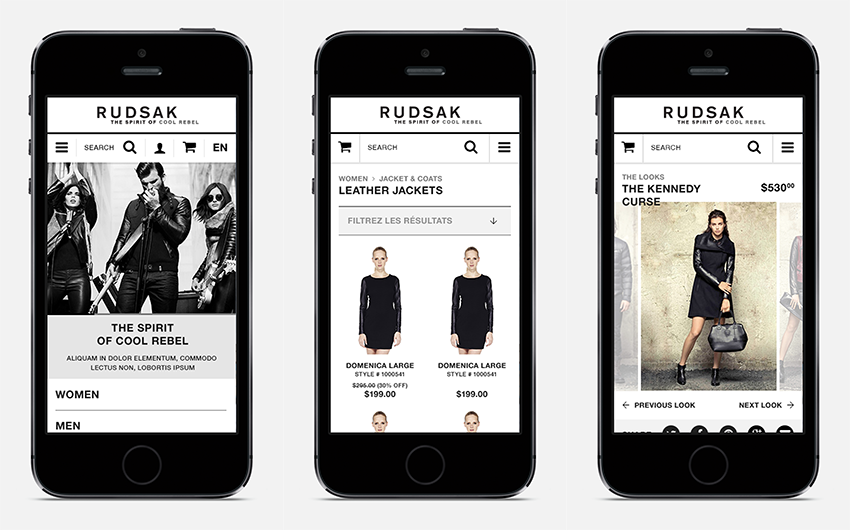
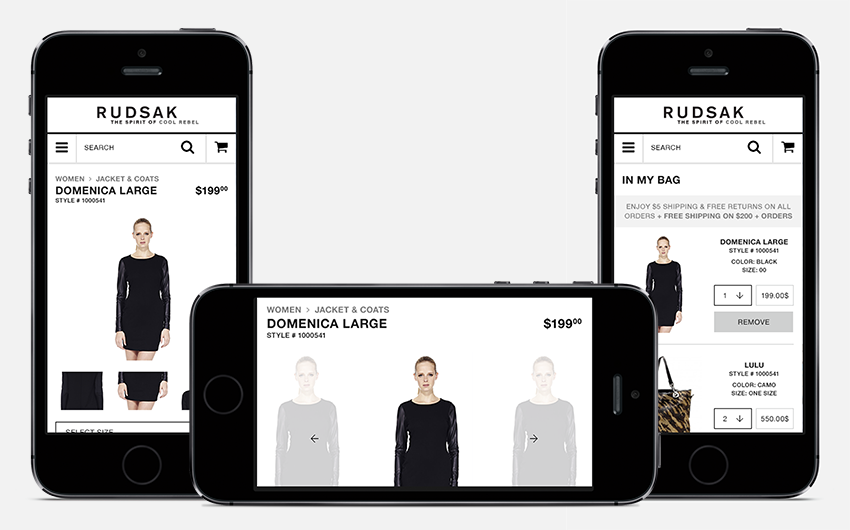
When Baobaz approached me to design the mobile shop for their client, canadian-leather-fashion-powerhouse Rudsak, I was thrilled as they already had developed an amazing aesthetic and I couldn't wait to bring it in a functional mobile dimension.
Based on Baobaz's strong market benchmark of the biggest fashion online shops, we worked our way through the sections to make them as mobile forward as possible and made one of the most brand-coherent mobile online shops.
Musée Mobile
Musée Mobile
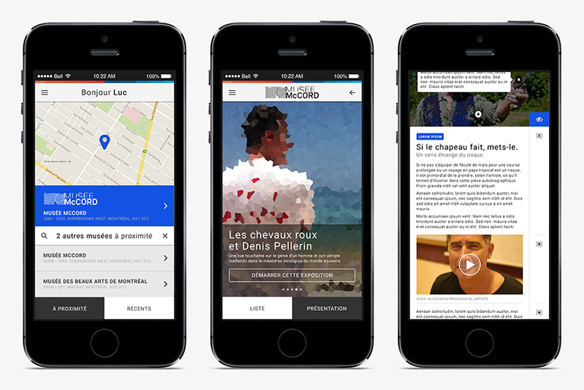
In early 2015, I was approached by Luc Normandin of 2Guid to work with him on his latest endeavour: an application that would revolutionize visits to the museums. My job would be to build a brand, design the app and the user flows.
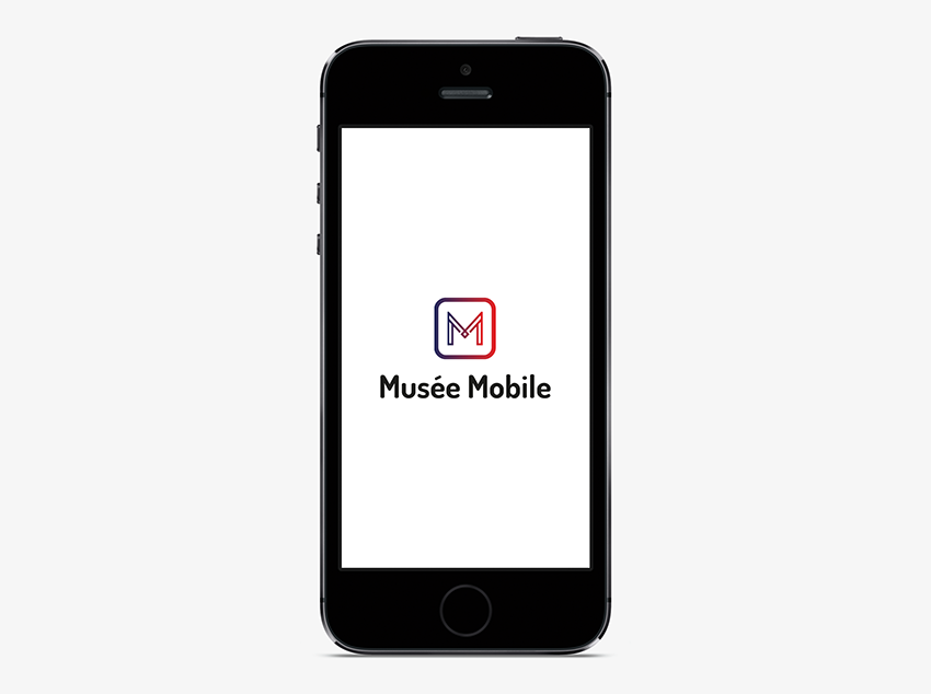
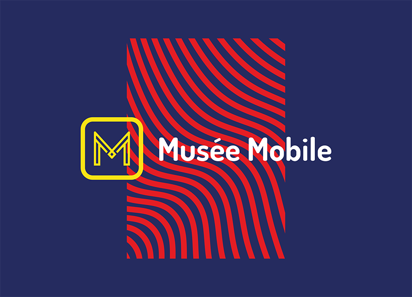
Drawing inspiration from bluetooth beacons, the technology that powers the first version of the app . The icon is represents two “M” stacked on the top of each other with an interpretation of the beacon at the center of the icon. It is meant to feel friendly, yet structured and powerful, to go well with the app.
The logo is flexible, recognizable and works great at any size. It is shown in a colorful palette to illustrate how strong it remains through adaption to its environment.
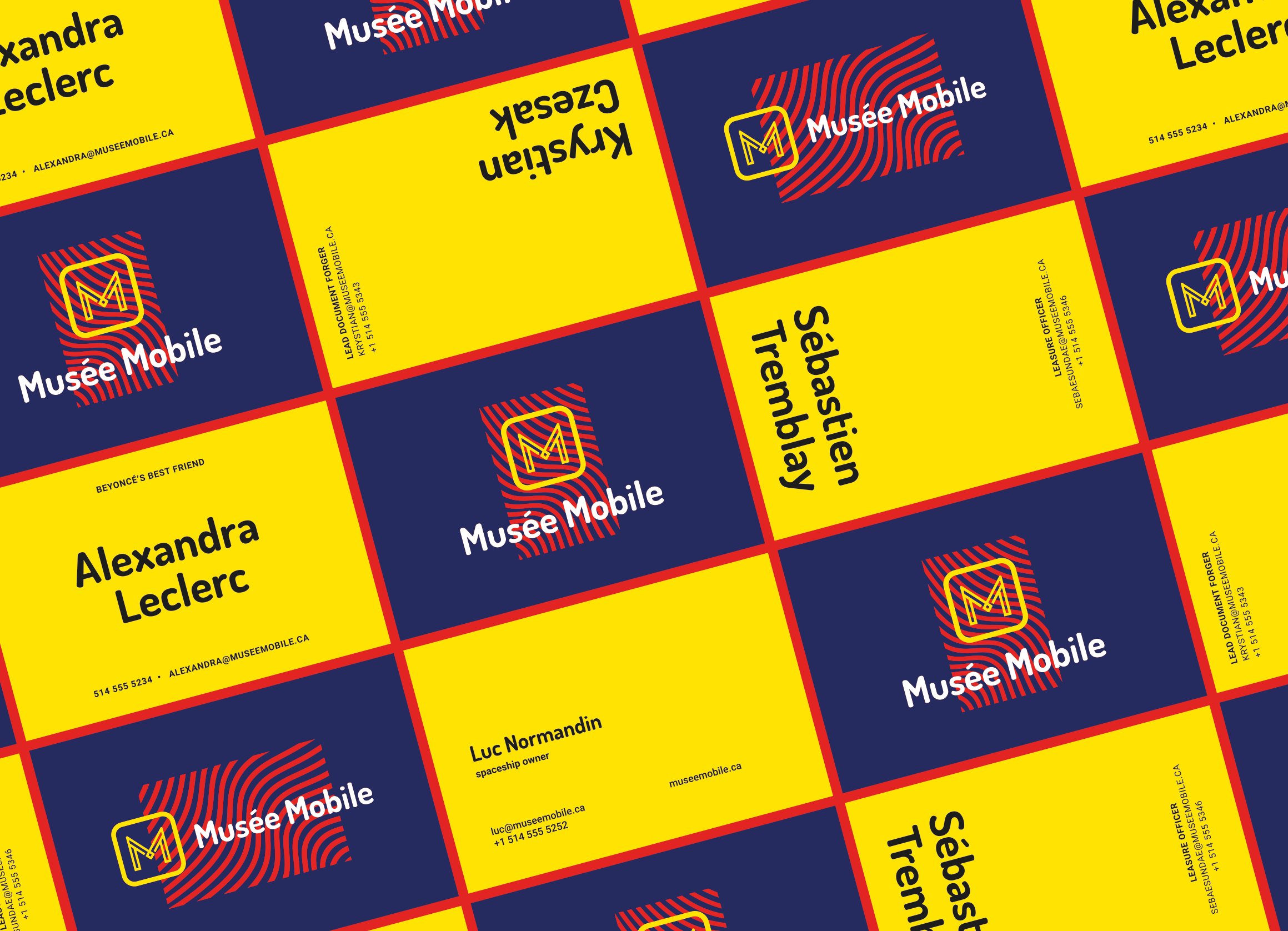
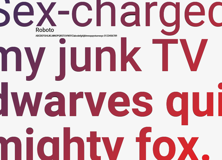
Roboto was elected as the companion font for the entire project. It’s a modern neogrotesque font that was designed for user interfaces and that is widely available, hence making uniformity easy across the brand.
The app is still in a prototype form and is awaiting redesign for it's first official version and a entirely reworked userflow. Here is a quick look.
Out Of Sight
Out Of Sight
Straight out of Montreal, OOS is a young & ambitious digital art collective specialized in creating mesmerizing interactive spaces. They asked me to design both a logo and a website for them.
Putting in image their name, the logo represents an eye without an iris and I made sure it conveyed a rugged feel by constructing it with agressive lines, which also is a nod to the generative nature of their work.
The iris is replaced by their initials, using a monospaced font, another nod to their technological background.
Their website is based on a very simple grid that overlays itself over the featured content. The featured content is grouped by project and can either be made of static images or videos to better show the interaction of their installation.
If you'd like to get in touch with me, you can send me an e-mail or take a look at my LinkedIn profile.
